- Collected
- Article
On Marbling
Colour, connection and chance
- 21 June, 2021
- Penny Boxall
Part way through volume three of The Life and Opinions of Tristram Shandy, Gentleman (published in nine volumes, 1759–1767) Laurence Sterne’s eponymous hero presents us with ‘the marbled page’:
Read, read, read, read, my unlearned reader! read—or by the knowledge of the great saint Paraleipomenon—I tell you before-hand, you had better throw down the book at once; for without much reading, by which your Reverence knows I mean much knowledge, you will no more be able to penetrate the moral of the next marbled page (motley emblem of my work!) than the world with all its sagacity has been able to unravel the many opinions, transactions, and truths which still lie mystically hid under the dark veil of the black one.
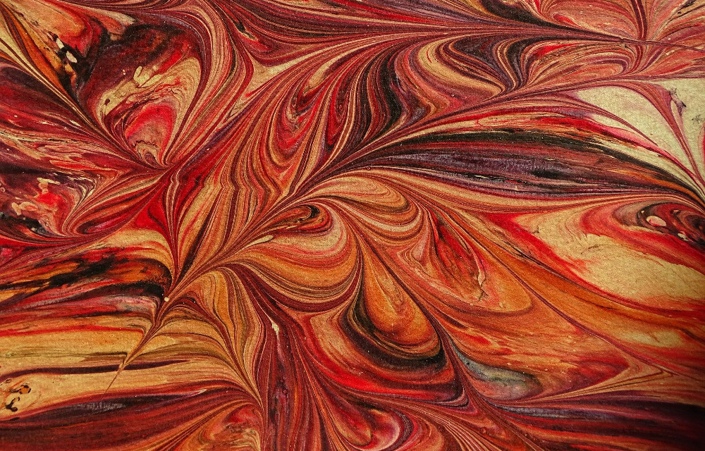
In early editions, the page is a unique patch of beautiful noisy colour. Patterns seep and bleed, little archipelagos rising from a crazed ocean. All life is in that page, but its meaning – pardon me; its moral – lies somewhere in the interstices between the shapes, hidden under overlapping layers.
Marbling and books had long been companions by the time Sterne published these words. A process originating in East Asia, by the seventeenth century marbling had arrived in Italy, and was spreading, like a glorious slick of oil paint on water, throughout Western Europe. Marbling quickly came to occupy the spaces in and around books. Books opened with speckled or swirling endpapers and, a few hundred pages later, closed with them. Marbling lined bookshelves, or patterned the edges of a book’s pages. But Tristram Shandy used marbling as part of the tale itself: both plot-point and narrative gloss.
Sterne did not specify in the text what sort of marbling he envisioned as Tristram’s ‘motley emblem’. The original text, instead, carries an instruction which seems more concerned with layout than content: ‘The Bookbinder is desired to cover both sides of this leaf with the best marbled paper, taking care to keep the folio lines clear, and to preserve the proper margins.’ (When did Sterne ever preserve margins, proper or otherwise?) But one assumes, given the wonderfully scattergun nature of the book as a whole, that a randomised marbling is the intended effect, rather than peacock feathers (now called ‘Dutch’ pattern), or fan-shapes, or brush-stroke swirls (‘French’). Indeed, an analysis by Diana Patterson of first-edition copies highlights the prevalence of ‘Turkish’ marbling — blobs blobbing within blobs, pink and yellow and green. Sterne knew, he demonstrated, that in life there are no straight lines; so his marbled notation must surely require something more closely resembling a map of tricky terrain than predictable, well-trodden paths.
In marbling there are no second chances: just a gung-ho opportunity-grabbing kind of joy. Oil-based paint is floated on the surface of thickened water, or ‘size’, and stirred (traditionally) with a stick, comb or rake before a sheet of paper is laid on the liquid. Even a small interruption while the marbler is at work, a delay of a few hours, will alter the hues; and once the paint is skimmed off the size in which it floats, that’s it. The hungry paper has absorbed its pattern; the design is set.
I’ve been fascinated by marbling since I was six, when my mother took me on holiday to Venice. My father – ah, but here I am sounding like Tristram! – my father did not accompany us, but as he worked for the airline and the plane was fully booked, my mother and I travelled in the cockpit. I’d never seen so clearly nor so strangely. We flew over the Jackson-Pollock Alps and across the clear lagoon, descending towards a swirl which resolved into islands, buildings, streets, stories.
I was intrigued by the light and colour in the shops, the specialisms like Murano glass and Burano lace, but most of all by the paper. Mum gave me a leather bookmark covered in deep blue ‘Dutch’ marbling, and I thought it the most beautiful thing I owned. I was precious about it, tucking it between the pages of my book as though putting it to bed. To me it was an emblem of access. Books signified escape, and the bookmark was the sumptuous flag of the republic of reading. I kept it safe, a tiny edge of Italian lake to dip into during dim Aberdeenshire afternoons.
Years later I returned to Venice with a friend. We’d gone for a long weekend to the Carnival, dressing in charity-shop approximations of eighteenth-century costume (though the floods meant our efforts ended, abruptly, in Wellington boots). We wandered so far our feet blistered, crossing and recrossing bridges, following trails and chasing rumours of music or some delicious delicacy; and so it was quite by chance that we came across the workshop of Paolo Olbi.
Olbi is one of the last traditional bookbinders in Venice. He is a true artisan, one who specialises deeply in a single skill. In his case, it is the binding itself — working to methods which would have been familiar to his Renaissance counterparts. He doesn’t marble paper — there’s another specialist for that, and another to gild the leather, and another to make the thick and creamy paper itself. The craftspeople comprise a delicate ecology, something perhaps like a coral reef: each tending to a small but specific function; each dependent on the other. Though I’m not usually a user of notebooks for writing – I prefer to use impersonal-looking, and above all legible, note apps on my phone – I came away from the shop with stacks of gorgeous bound volumes. I wanted to put words between the covers, to bed in among the marbled pages. Surely if you wrote within such a beautiful space, your words would have some sort of intrinsic value; so I hoped.
A few years later, I was again in Italy. A stay in Florence had been overwhelming. Every piece of art we’d seen topped the last, from the Brunelleschi arches to the Giotto frescoes to the Campanile, which looked like a tall slice of rose and pistachio cake: yellow and green and pink. The air fizzed with bells and swifts. Each evening we’d been too tired to talk, happily scrutinising plans of the city, plotting for the next day while scattering crumbs and almonds from a panettone all over the map, and drinking Bellinis the colour of dawn. And on the last day – luck of luck – I’d found that the Casa Guidi, where the Brownings had lived for a time, was open to visitors.
My boyfriend and I were the only visitors to the apartment, which was owned, improbably, by Eton College, and reached through an unassuming door. It felt almost as if you had to be invited, or leave your letterpressed card on a tray in the hall, to return later, when the Brownings were ‘at home’ to visitors. As it was, a quiet custodian led us up cool marble stairs, unlocking the apartment’s front door with her quite ordinary latchkey.
It was a refined set of rooms, designed for light and comfort. I gazed at everything from the stucco to the carpet, and tried to get inside the past — to slip between the papered walls and into the colours of the nineteenth century. The bronze hands of Robert Browning and Elizabeth Barrett Browning intertwined on a low table, touching.
Out from this swirling of colour, of presences and absences, and down again into the street: almost next door is Giulio Giannini e Figlio, the paper shop and bookbinder whose display windows, even today, spill colour, with marbled paper gracing the covers of diaries, journals, address books and smartphone covers. I couldn’t resist.
When I stepped inside, a delicate negotiation was taking place. I’d arrived in medias res. An elderly American was pressing looks, then compliments, then money on the young artisan (her hair caught up in a marbled rag) and I, too shy or uncertain, too unclear on the plot to interrupt, lurked in the dazzling aisles until he finally, finally wandered out again. The woman turned to me with tears in her eyes.
‘Why didn’t you say something?’ she laugh-cried. I didn’t have an answer. I had observed; I had tried to read the story. Bursts of colour, shade and light; something that shifted depending which way you were looking. Like Sterne’s marbled page, the scene’s meaning – all right, its moral! – lay under, between, or somehow through merged layers, rarefied patterns.
I came away with a marble-covered diary, a talisman for a speckled year to come; and a new marbled bookmark, to mark my place.
You might also like:

WritersMosaic & Jhalak launch The Review today
The first issue of The Review by WritersMosaic & Jhalak is out today. The Review is an editorially independent, 20-page…
Tenementality
I shouldn’t be here. No, I didn’t have a near-death experience; it was Glasgow that almost died, bulldozed into oblivion.…
No facts, only versions
Memoirs are as much about what is excluded as what is included. This edition examines how you can evoke the…