
- Collected
- Article
From cover to cover: Abigail Avis on writing Wet Ink
- 24 August, 2026
- Abigail Mann
Over the last few months, Abigail Avis – who also writes as Abigail Mann – has been talking us through the journey to publication of her book, Wet Ink, described as a “striking, smart and sensual bookclub novel.” We’ve heard how she completed the first draft while pregnant, and how she managed the editing process alongside caring for a newborn baby and her older child.
Now, we’re in marketing territory. From publicity meetings to cover design and the differences between the UK market and the US, Abigail takes us through the publication schedules, the proofs and the plans afoot to help bring Wet Ink to life.
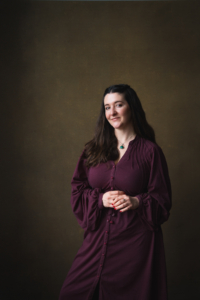
I can only fall back on clichés when I try and put into words what the past nine months has been like. I’m still in denial, I think. Up until last autumn, Wet Ink has sat in a liminal space, specific to me, and I don’t think I realised that I would be asking someone else to communicate its message before I sat down in the pitch meetings and thought to myself: okay, so I know what I want my story to say, but what do you think? I was too preoccupied with feeding the baby, burping the baby, and—quite honestly—had half a mind on what I might do if she vomited across the boardroom to give too much thought to it. I saw it as a story, but publishers would see it as a product. The plans for publicity, marketing, and cover design are only just unfolding, but in the UK and the US, there has been a confidence about how to frame Wet Ink that picks up on something I believe readers are wanting to see and feel more in this ever-digitised world: tactile, nostalgic, and radical stories of change.
It was around ten minutes into my meeting with Hodder and Stoughton that I picked up a rock cake that had been made for the meeting and presented to me in a box branded with the sigil that my protagonist – Mitzy Barlow – uses to secretly sign off her stories of desire. Very quickly, with my five-week-old baby slung across my shoulder, I got a sense of how the marketing and publicity plans might look. A south London housewife smuggling erotic short stories inside Tupperware against the backdrop of 1969 second-wave feminism lends itself to marketing and publicity plans that play with the bold, radical, and nostalgic spirit of the time.
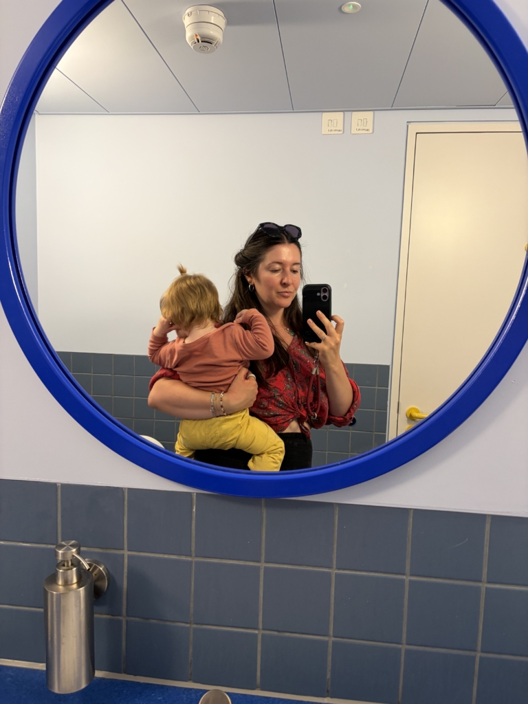
Abigail Avis and her daughter during a break from one of the ‘Supperware’ parties thrown to share Wet Ink with booksellers.
Early on, my UK publisher had ideas to go out with a limited run of clothbound, hardback proofs, each depressed with a three-pointed crown, a ribbon marker, and boasting generous words of support from independent booksellers who read the book early. To share these, we hosted a ‘Supperware party,’ and a letter I wrote to booksellers was slipped inside Tupperware marked with quotes from the book. I was so nervous about attending this – my first event – that I did five laps of Bloomsbury Square, refusing to make eye contact with the display board featuring a glowering Virginia Woolf, and turned up convinced I would forget how to speak about my own book. Inside, we had candy cigarettes. We had postcards featuring quotes from the book. We had a pub function room. We had placards. We had the dauntingly well-read Natasha Poliszczuk interviewing me and what came next was… relief. Finally, I could hold my book — albeit chunky proof editions that reminded me of late 60s romance epics — and talk about this story that has a chokehold on my heart.
I’ve never before been in a position where my writing has been picked up in multiple countries, with different audiences, each with their own cultural reference points. As the weeks have ticked on, plans have populated the calendar, more of which will be shared as we reach the six-months-out mark. After the initial ‘Supperware party,’ thoughts have turned to cover design, and although I’ve always noticed that covers are different in the UK and the USA, I’ve never really understood why. Different territories come with their own cultural touchstones, and aesthetic preferences change depending on genre, but also generation, and format (paperback, hardback, etc). I was nervous about cover design – of course I was – it’s the window into my story and I want it to lead readers in the right way. Seeing as Wet Ink is not clearly sat in any one genre, it was communicated early on that a unique approach was needed for the cover. Authors do not always like their covers – that’s the worst kept secret in the industry – but right from the pitch meetings I knew that I trusted the design team to deliver on something bold. I don’t think it was easy for them, because good things take time, and this cover needed to achieve many things at once. Recently, my US publisher shared their cover for Wet Ink and to say it’s swoon-worthy is an understatement.
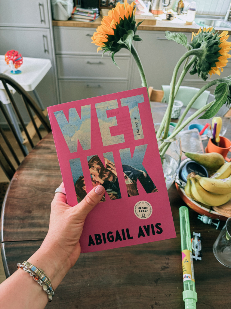
Abigail holds a copy of the American galley for Wet Ink.
My incredibly talented cover designer over at Dutton, Vi-An Nguyen, had this to say about the process:
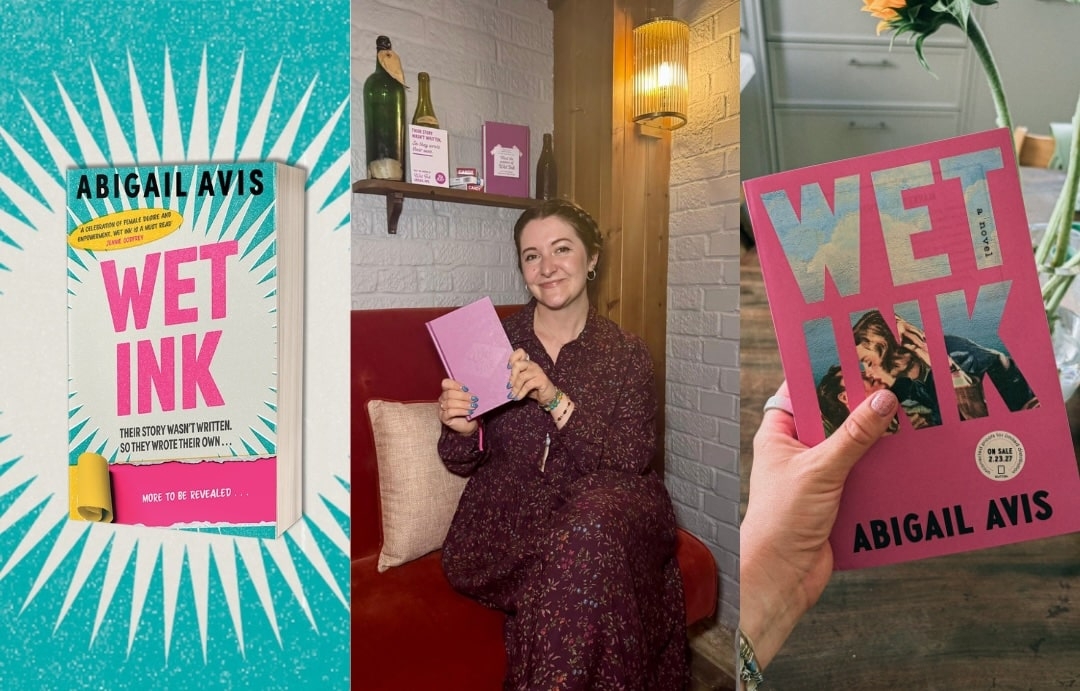
We wanted the cover to be boldly feminine and to nod to the “stories within the story” — so we conducted a wide search for archival romance cover art to find the perfect piece, and placed it strategically inside the title on a hot pink field.
As for why UK and U.S. covers are sometimes different, I find it comes down to the gut instincts of our publishing teams about what will resonate within American culture. Oftentimes, that means big, audacious typography, which we certainly see here!
I love this cover so much. I didn’t think it was possible to love both the UK and US cover equally, but I really, really do. Revealing a cover is a carefully planned part of strategy, no less because it’s the first time that readers can attach a visual to a concept. Vicky Palmer, creative and marketing director at Hodder & Stoughton, knows this only too well.
Cover design is one of the most complex and hardest parts of the process to crack, for a number of reasons. We all respond differently to design and each have a very subjective view of what a ‘great’ cover looks like, plus we have a wide number of international markets to reach with varying needs and cultural touchpoints.
That’s especially true for a book like Wet Ink, which defies straightforward genre categorisation (in the best way), which we want to stand out from everything else already out there (not easy when there are thousands of books published every year) and which makes a real statement about the brilliant story beneath the cover.
At Hodder & Stoughton, we are incredibly proud to have a combined Creative directorate which means we have Art and Marketing feeding into a Creative and Marketing Director (me!) whose role it is to ensure that everything we create in our Art team has a clear and strong market-based brief and designated audience, and everything we produce in Marketing has a beautiful, high-quality design behind it. This was the ethos of our Wet Ink design brief, for which we wanted to deliver a cover which delivered a number of ambitions: bold, original, eye-catching and something which nods to nostalgia whilst showing the spirit of Abi’s amazing novel rather than trying to explain the narrative.
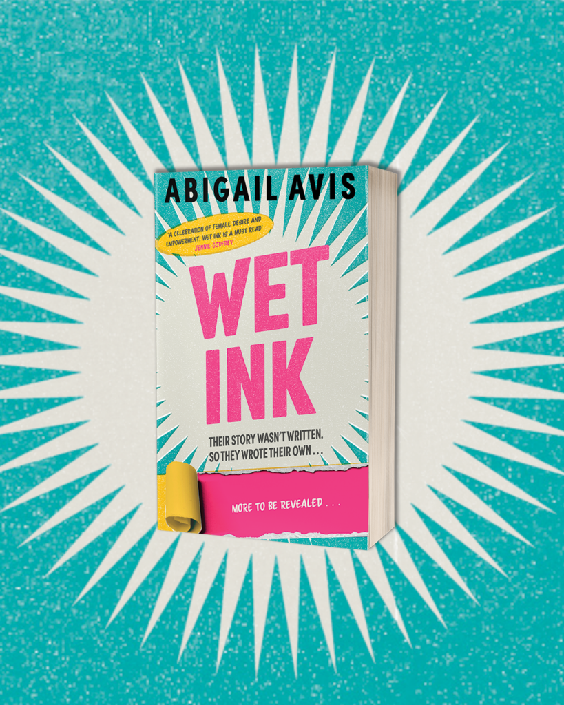
The UK trade paperback cover of Wet Ink.
Soon, proof copies (or galleys, in the US) will be going out to readers with the aim of generating early buzz, and I expect at that point I’ll attempt to stick my head in the sand… but luckily there are plenty of events in advance of publication to keep myself distracted with.
Next time, I’ll be a few weeks away from publication, and so long as I don’t pop with anticipation before then, I’ll check in with you then.
Love,
Abigail
This article originally appeared on our Substack.
You might also like:
Final Draft: Abigail Avis on writing Wet Ink
In the second of our four-part blog series, Abigail Avis talks us through the editing process of her novel, Wet…

From first draft to final edits: Abigail Avis on writing Wet Ink
In the first of a four-part series on the publication of her book, Wet Ink, Abigail Avis takes us back…
A decade on: Matthew Todd on the ten-year anniversary of Straight Jacket
This Pride Month, RLF beneficiary Matthew Todd reflects on a decade of his seminal book, Straight Jacket.